16 Aug Retargeting Dealio on Twilio…
 In past jobs, I worked with an interactive marketing campaign manager whose job was simply to get qualified traffic to our landing page experiences. When the “stuff” hit the fan, and a campaign did not go as planned, he would always just say, “…HEY! I got the traffic there!”.
He was 50% right. Yes, he got the traffic there. But the disconnect could have happened in two general places.
- The traffic was not qualified enough
- OR, the messaging which he was using to attract the lead to the landing page experience was not presented well enough for a desired action to take place.
So today, I look at a live interactive marketing campaign and point out a few pros and cons.
In the past week or so, I have been researching SMS API’s. What a serendipitous find to come across Twilio when reading avc.com!
So since I went to their site, I have experienced first hand what an AWESOME retargeting campaign they have. I am seeing Twilio on lots of sites that I browse.
Today, I saw their retargeting ads on The Search Engine Weblog, and low and behold, their spend allows them to be doubly-placed (Two Banners on same page).
Retargeting Defined: So, retargeting works by strategically presenting banners and/or contextual ads to potential customers who have visited a particular site. When a lead source sees the site banners elsewhere, they are re-introduced to the offering and may have a higher probabilty of returning to that site to cash in on the offer.
So I clicked through and made the guys over at the Search Engine Blog some cash. (Sorry, no fraud intent… just wanted to see if the offer was different than on their pricing section.
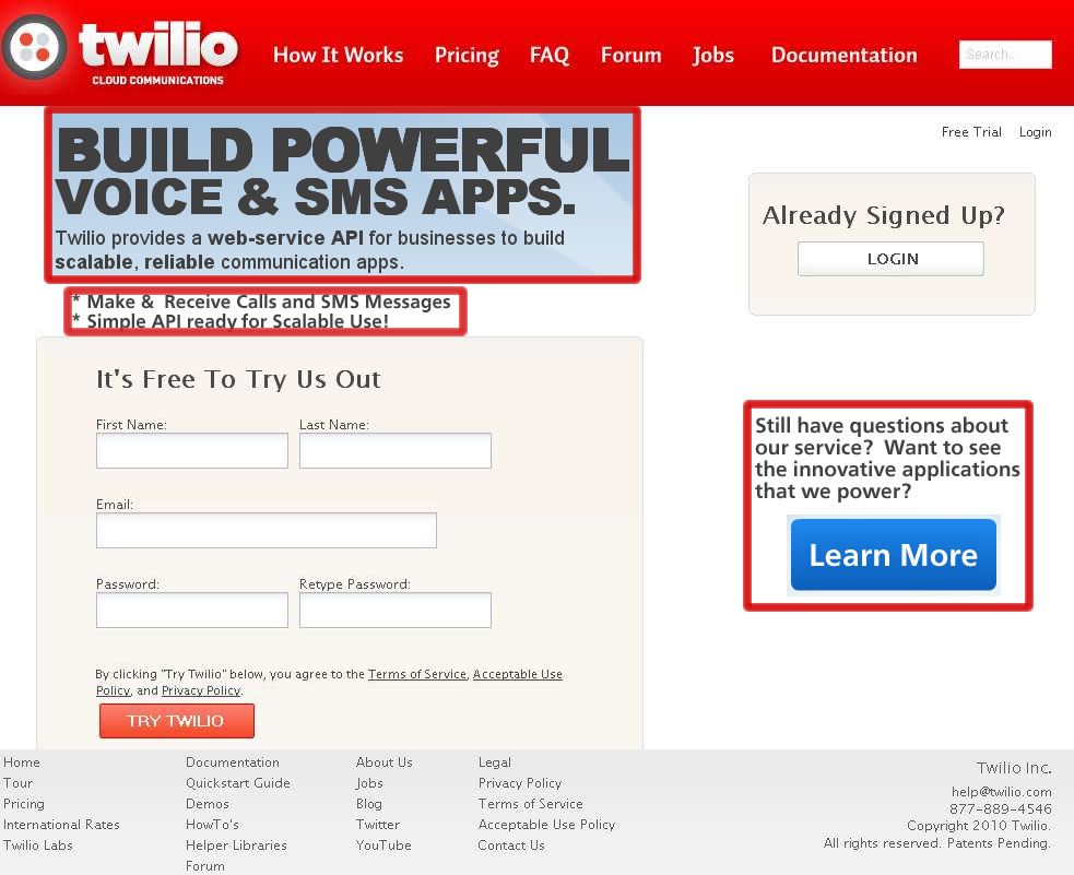
Here is what I saw on Twilio’s landing page after clicking on the Banners shown above:

Feedback.
- Good Pre-Click Message: The messaging on the banners displayed above is simply “Build Powerful Voice & SMS Apps”. This is a strong call to action for the right audience…. Developers. But what if I was a chief decision maker wanting more information?
- Pre-Click Banner Messaging: Some say that banners should visibly have a call to action such as a “GO now” or some type of arrow indicating that it is clickable. Others say the general population would know that the banner itself is clickable. It could be tested.
- Landing Page Experience: Personally, I believe that there is a big mismatch from the banners to the landing page.
- TRY TWILIO: Ok, so that is a clear purpose to the Landing Page. Easy enough. But can I get some information about what exactly Twilio is? What exactly am I signing up for? How about a duration of the trial? After I click, TRY TWILIO submit button, will you be requiring a credit card, or is the account “ready”? Am I willing to place my email and information into the signup form to see what’s behind the curtain?
Suggested Modifications (Can be easily tested via A/B)

- Add a Page Header & Sub Header: This reinforces the messaging that attracted me to click through. In the image above, I simply snatched their true home page header. It is effective, but could be dynamically generated to match pre-click ad copy.
- Add an easy bullet list of benefits: What sets you apart from competition? Why should I sign up? Summarize this in a quick and easy check list.
- Their form stays…. it is easy to use… and simple!
- Right Nav Learn more: Is this the product for me? I am still confused. Where do I get FAQs? This message box on the side could be useful for the end user who just needs a little bit more information before converting. This may also be a place that Twilio could briefly summarize a list of logos that have used the API in order to achieve success. This call to action should be muted more… (My Pseudo wireframe is suffering). But the size of the button should be minimized and even the color could be muted to lessen the eye tracking to this call to action.
Overall, I am already a Twilio fan and look forward to using their tool. If they read this, I am hopeful that they take the suggestions in good spirit, and if the results of improving their Landing Page Experience benefit them, I hope that they can share the results!
Simple suggestions like these:
- Maximize their spend ROI on Retargeting and any other pre-click marketing efforts, by increasing Conversions
- Decrease Landing page bounce rate.
- Are easily tested with MVT and A/B test runs.
What do you think?
No Comments