02 Apr Heat Map Tool Proves to Be a Hit with Analytics
At the SES Conference in New York, Tim Ash unveiled his Landing Page Optimization tool, called AttentionWizard.com
Very interesting concept, in which his software application scans an uploaded image of your landing page, to help you determine the natural progression of eye flow on a given page.
We put the tool to the test on a single landing page. Now, some of us, as “color blind” Interactive Marketing professionals may not see the page flow incongruousness as others. So this tool may benefit your landing page analysis. I am adding it to our tool arsenal, in conjunction with other click and heat map tools.
Here are our results:
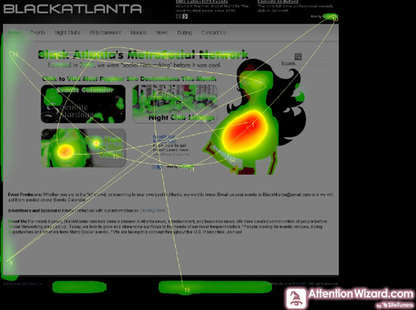
Page as analyzed by AttentionWizard.com

Page as Analyzed by Google Analytics’ Click Mapping feature with one of the hot spots above receiving highest click rate.

Now, to some, this could be common sense. However, there are a few take aways from these two images.
- Out of three “button-like” images, the one button clicked the highest was one of the two heat zones detected by the software.
- The major heat zone image, the hero image on the right… should be muted. There was a radial gradient very attractive to the eye and to the software. Also, this image is NOT clickable. Perhaps, if a clear path and user expectation could be set, she needs to be.
- The other buttons should be simplified, with a replacement of busy or dark imagery, with something more ‘digestible’ by the eye.
Clearly, we have some multivariate testing to do.
Check out the tool and let me know what you think!
No Comments